

Challenge: After Covid-19, the trends of online shopping keep going up, while local small businesses are still experiencing hardships. There is a plethora of blogs, directories, and web guides that encourage shoppers to support small business in Massachusetts. But these resources are not effective as consumers prefer social shopping websites to traditional resources. However, a market gap analysis that I have conducted online has revealed that there is an opportunity for designing a unique experience that connects local small business owners with the local communities in the Metrowest region.
Solution: Design a website which will help small business owners adapt to online shopping experiences. The website will offer a social directory of businesses where local communities will engage with small business owners via storytelling and a personalized shopping experience.
First, I decided to gather information from random shoppers using a street questioneer at The Natick Cultural District , the historic shopping center located in downtown Natick, and at Concord Town Center. I surveyed 148 people in total. Out of 3 questions, the main question targeted the importance of an emotional connection with local small businesses at a given location. I have found that 3 out 5 users have strong emotions with a local small business.
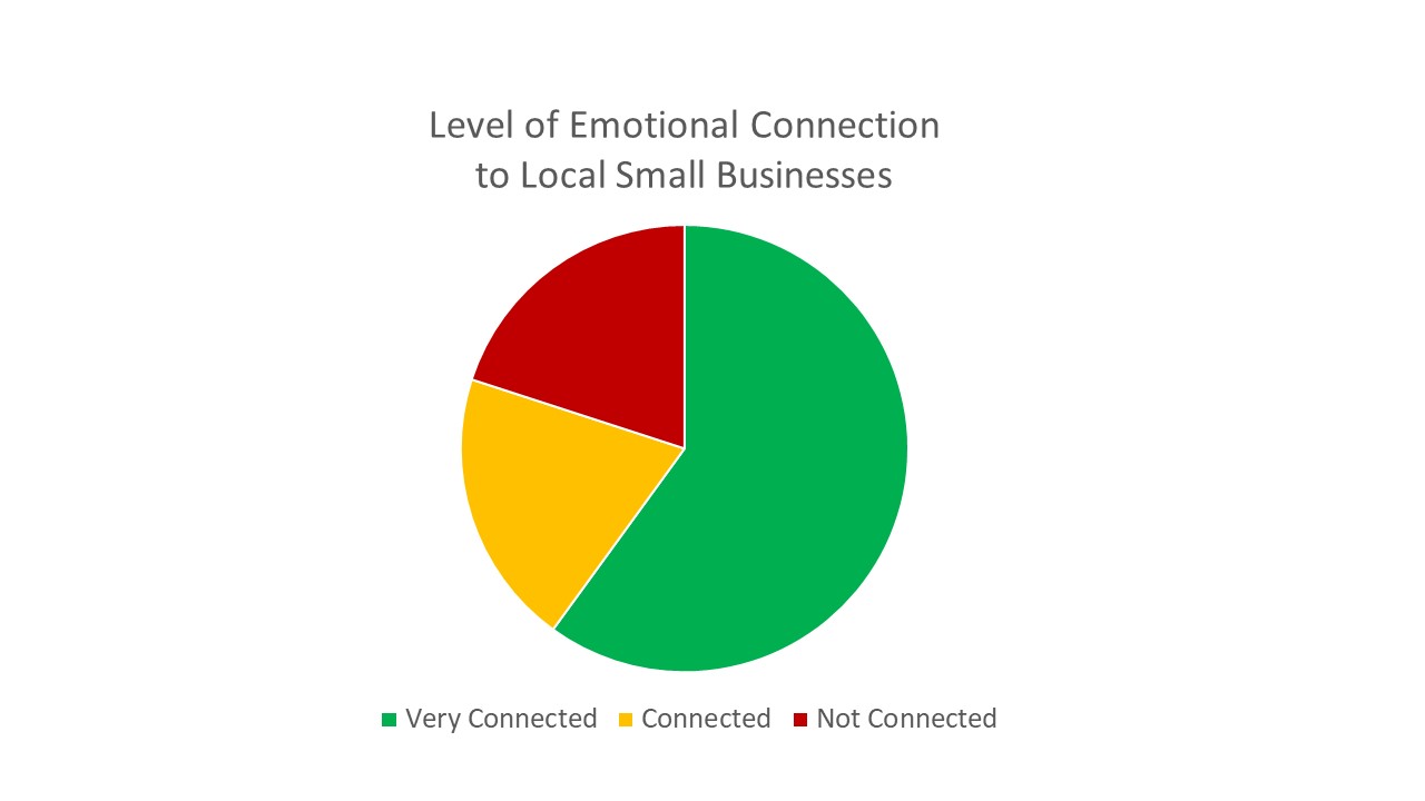
Users have a strong emotional connection with small business because they appreciate personal customer service and a sense of local community. The humanization of service and a cozy feeling of a neighborhood business is missing when shopping online.
Megan is a customer persona I have worked with throughout the project. Megan a is full-time professional, married, wanting to have children, 27 year old female. She enjoys travelling and shopping.
Megan has a strong emotional connection with small business because she appreciates personal customer service and a sense of local community.
Here I used a different approach because the population size of small business owners in the Metrowest and the variability of business industries would have been too large to be manageable and cost-effective for my intent to obtain statistically significant results. Instead, I decided to form a focus group discussion on the topic of “What should a relationship of a business owner be with their local community?” I wanted to understand differences in emotional language of business owners at a deeper level than the information I gathered from government sources and economic development agencies.
The majority of business owners agreed that their small businesses empower local communities socially and financially. The main pain point was their sense of frustration that many customers are loosing the sense of neighborhood community and are increasingly driven by online consumerism.
Ron is a business owner persona I have worked with throughout the project. Ron is a 60 year old male who has a run a 2-4 staff family business for thirty-five years.
Through detailed sentiment analysis using NVivo software, I analyzed and classified emotional tone and context of keywords from the user survey and the focus group transcript. Besides analyzing the expression of positive, negative, or neutral sentiments, I extrapolated the positive sentiment regarding a hypothetical social directory where customers not only discover a small business but also engage with the story of the owner and the staff.
The following user journey illustrates a hypothetical positive customer experience:
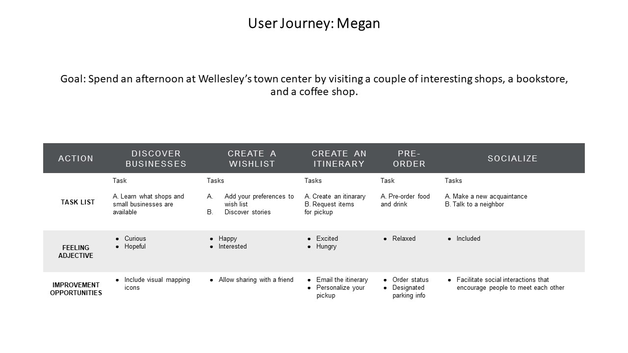
A small business directory in Metrowest, MA, with a social engagement and an emotional appeal to the sense of local community will offer a virtual gateway to personalized introductions both for customers and small business owners.
As I have mentioned, this is my personal project because my objective is to experience a complete cycle of product development from beginning to end. In the real world scenario, I would use the Agile method that would involve a collaborative work in small increments, as well as ideation techniques that work best in a team setting. Nevertheless, I still prefer to use Agile method in the sense of planning to launch the website with small increments of improvements to UX and UI rather than to wait for a single, large-scale launch of the final product.
Sitemap: For my first iteration of the website design I decided to synthesize the minimial requirements of Megan's user journey. The hierarchy of web pages consists of 15 pages which are prioritized, labeled, and linked.
User Flow Study: The following user flow study has allowed me to identify the main navigation experience. I organized information on the homepage around the following objectives - search, browse, discover, and contact.
Mobile-First Design: There are many advantages to starting a design using a mobile-first approach: statistically, users across the world increasingly rely on mobile devices to access information; a responsive design makes it easier for developers to scale up from a minimally designed user-centric website to a more complex website designed for desktop use; mobile interfaces are optimized for a faster download speed, which also boosts SEO rankings.
Mobile digital wireframes:
User Testing: Because the initial low-fidelity prototype at the initial stage of the design proved to be minimal in the number of pages and lacked search functionality, I decided to rely on the mid-fidelity prototype to validate the concept of a social directory. Of course, insights obtained from the feedback of user testers regarding usability, design, fonts, and colors, as well as copy and messaging, also played an important role in the first round of prototype testing. However, the main purpose of user testing (often confused with usability testing) was to understand if a proposed design meets Megan's needs.
Overcoming the mental block: At its core, I knew that my solution to build a connection between Megan and Ron is benefitial both to Megan's emotional needs and Ron's business goals. But I was missing the glue to keep this connection strong. Why is my design not "social" enough?
I allowed myself to think by taking long walks in the neighborhood while listening to podcasts that covered the topics of social shopping, online consumer behavior, and stories of small business entreprenuers. I also felt that my solo project was just exactly that - solo. It lacked a social spark, too. So I set up a meeting with my two friends who are also entreprenuers and we gave each other feedback on the projects we're working on.
Brainstorming: The feedback I got from our brainstorming session was that the primary user is Megan, a local consumer. I realized that a new design should focus primarily on meeting Megan's needs. But I felt that the perspective of Ron, a local small business owner, was as important to consider in order for the website to become a successful small business product in itself. After all, small business owners should trust my website in order to share their business stories. I realized that my own story had to play a role in building an emotional connection between Megan and Ron.
I approached three small business owners with a story of my own experience of emigrating to Massachusetts from Ukraine and how I fell in love with the culture of small New England towns. I told the inspiring story of my uncle who became a successful small business owner after going through a bankruptcy in the 1980's. I thanked them for their time and asked them to share stories about themselves or their friends who had to learn through trial and error on how to build a successful business.
As I was going through this stage of my design process, I came across the idea that small business owners rely on the use of “the American dream” as a metaphor for their entreprenuerial spirit. Not all local Massachusetts residents who care about their community have an entreprenuerial spirit. But they certainly would like to hear a good story and share it with others. Voila! Now I was ready to modify my design.
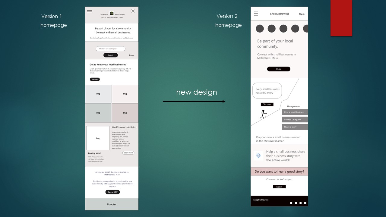
High-fidelity Prototype: As I was considering a color palette, I kept returning to the metaphor of “the American dream” and the language of patriotic symbolism
that I observed when talking to the small business owners.
This insight led me to the
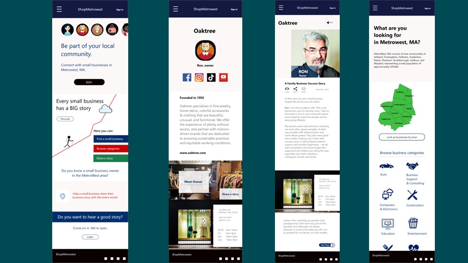
brand guide created by U.S. Small Administration. The final version of the homepage I therefore based on this brand guide,
especially in the choice of typography and color palette. I felt that my design decision reflected the spirit
of American small business entrepreneurship.
Impact: I hope to launch this website in 2024. The goal is to help small business owners adapt to online shopping experiences, to help local residents discover small businesses in Metrowest, MA, and to boost local economy.
What I learned: This is a large project for a single person. I am considering starting an LLC and to seek partners to run ShopMetrowest as a small business of its own. Please contact me if you are interested in forming a partnership.