

Red Tree Real Estate is a small boutique real estate agency located in Brookline, Massachusetts. Run by three long-time friends since 2013, the owners succesfully created a business culture based on the shared ethos of friendship, ethics, and personalized customer care. The RTRE website is an important window into the nature of Red Tree Real Estate as a trusted provider of real estate services.
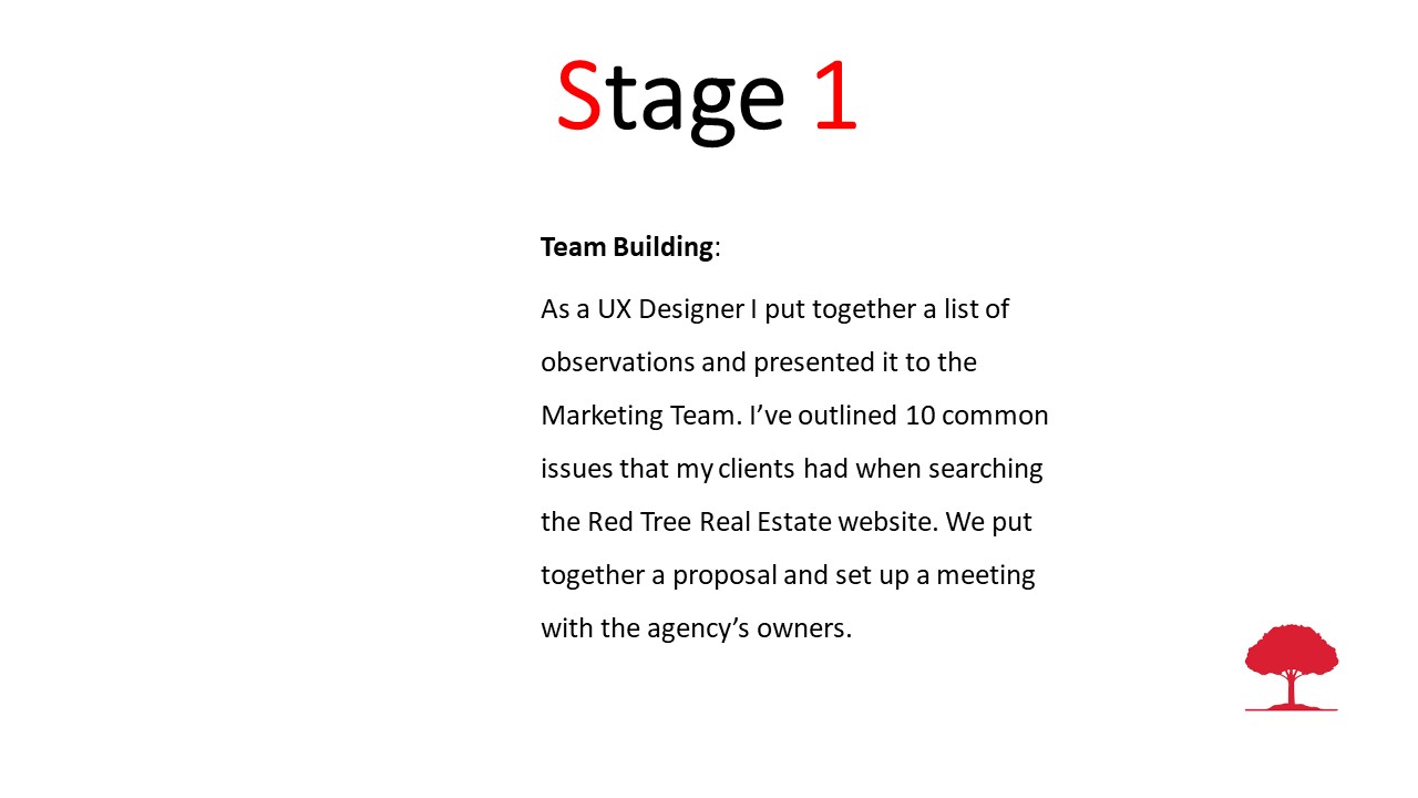
The Problem: I have pointed out to the marketing team that the RTRE search for rentals is not maximized for lead generation. My observation was confirmed by web analytics. As a UX Designer I saw this problem as an opportunity to investigate why the current design of the homepage does not maximize the quantity and quality of leads for the agency.
The Goal: My short-term goal was to understand how potential clients search for rental apartments using RTRE website. The long-term goal was to use insights of my research to design a usability study which would answer the following question: is it sufficient to redesign the search interface to improve the quality and quantity of leads or is necessary to redesign the homepage entirely? In my mind, if either of these hypothetical solutions were likely to increase the number of leads alone by 15% then the ROI from this project will be justified by RTRE financial managers.
The Challenge: The owners thought that the website does not need a major redesign. The website was recently updated and they were happy with the look and feel of it. My strategy to change their mindset was to offer a short presentation on usability issues and share a collective perspective by real estate agents during one of the regular weekly meetings. We agreed on the meeting day and time when the owners’ schedules are less busy and when most agents are usually in the office. My presentation went well and the 30 minutes team discussion that I led on this topic revealed an opportunity to increase leads for all RTRE agents.
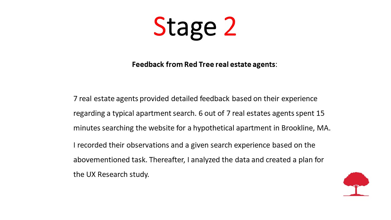
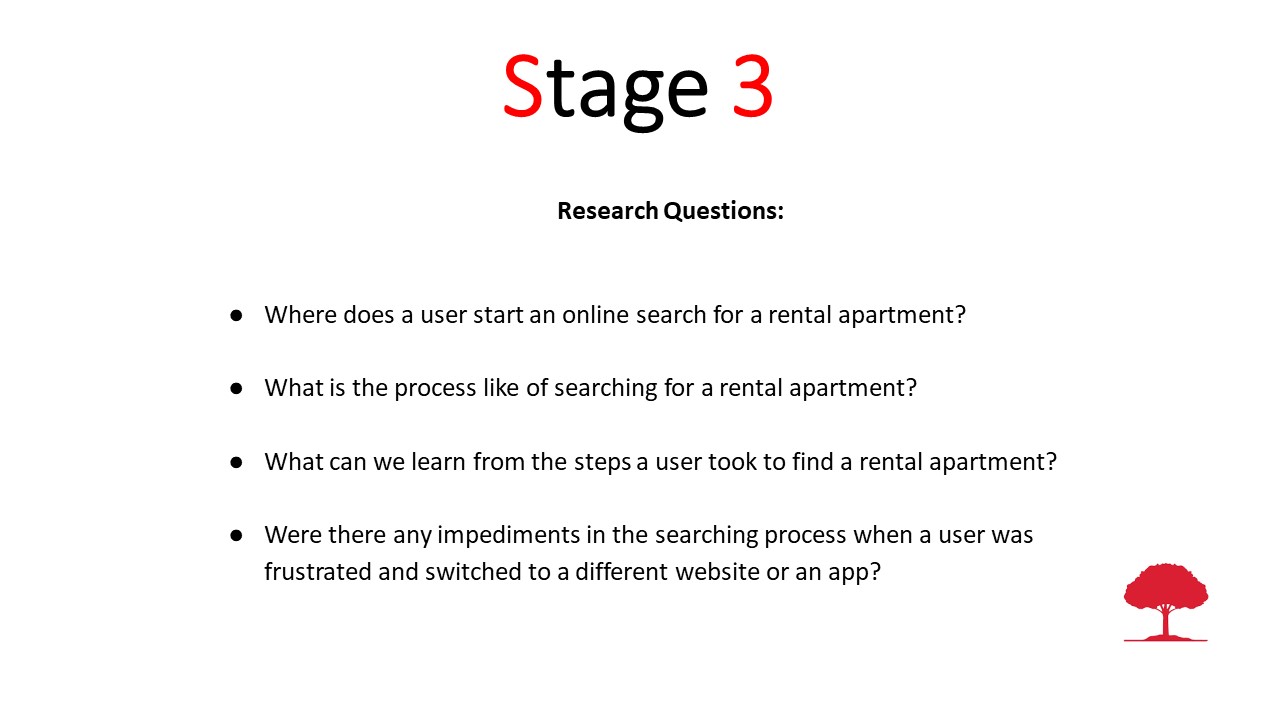
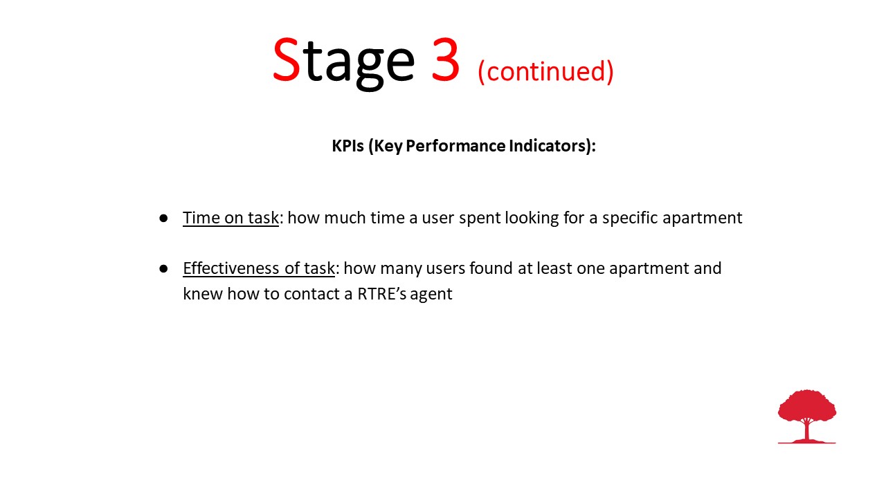
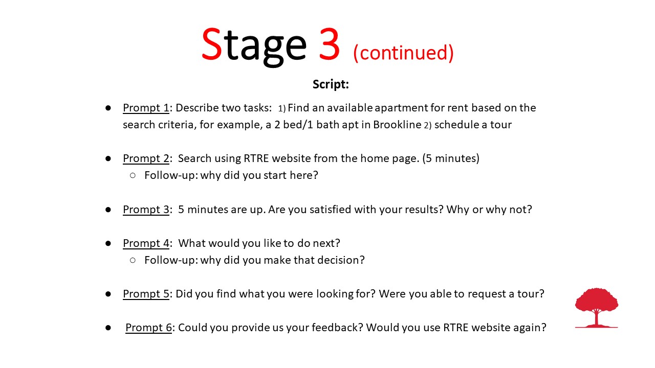
Usability Testing: Working with the marketing team, I created a landing page, a physical flyer, and a 7 day ad campaign on Facebook with the expectation of forming a small sample group. Based on my previous experience, I recommended to select at least 6 participants but no more than 8 participants. I have designed an online moderated usability test, in which six out of seven users completed their assigned tasks. Three basic paint points have been identified: the users failed to recognize a search link as a gateway to their rental apartments search, they were confused by the UI of the dropdown menu, and they felt that the label ‘Search for a Property’ was more appropriate for someone looking to buy property. It was revealing that in our sample group females in their mid 20s were more persistent in searching for the desired apartment using real estate agency websites rather than a search marketplace like Zillow. For this reason, the persona that I have presented to the owners was based on Meghan (see below).


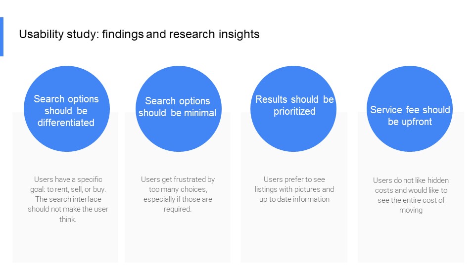
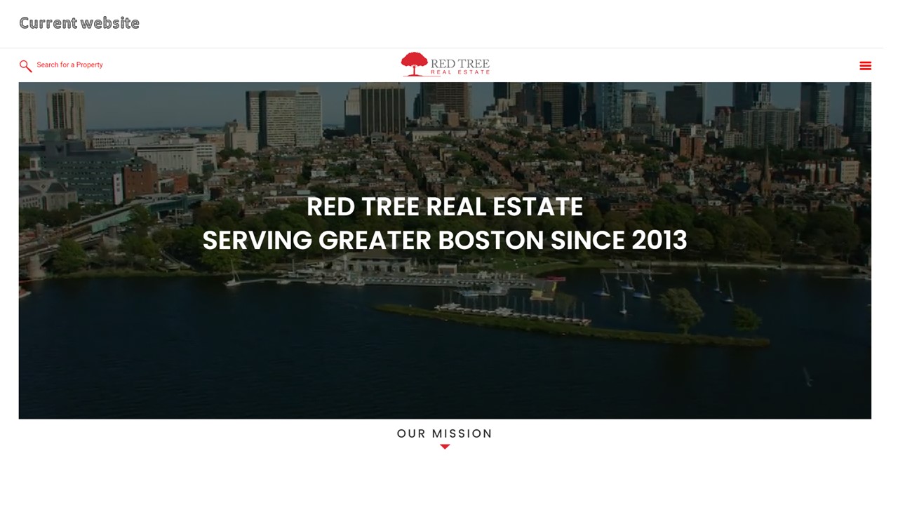
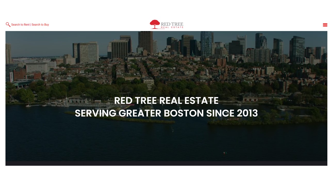
A/B Testing and Data Analysis: I created a split version of the home page by creating a clear separation between search functionality for rentals and buying of property. This decision was maded based on the data analysis of usability testing, in which the data confirmed my hypothesis that people searching to rent an apartment are less likely to click on the link in the upper left corner of the navigation bar. I used Google Optimize to run the experiment. The experiment demonstrated that the variable version outperformed the control version. As a result, the owners decided to make this small change immediately to the website design.
I have also followed up with a proposal of a major website redesign of the home page. I've presented the proposal in which I've outlined the reasoning behind the proposed redesign and supported my thinking with a basic visualization of the hero section using a Power Point slide. The visualization was based on the mockup I created in Figma. I felt that a presentation of a wireframe would not be as successful because the owners make decision quickly and prefer to see a final product. On the other hand, all three owners rarely attended weekly at the same time, and they were more familiar and comfortable sharing visuals using Power Point slides for feedback. After coordinating a 15 minutes follow up meeting with them after they all looked at the slide, the stakeholders aknowledged the benefits of A/B testing and expressed interest in testing a new homepage.
Redesigned Hero Section and Navigation
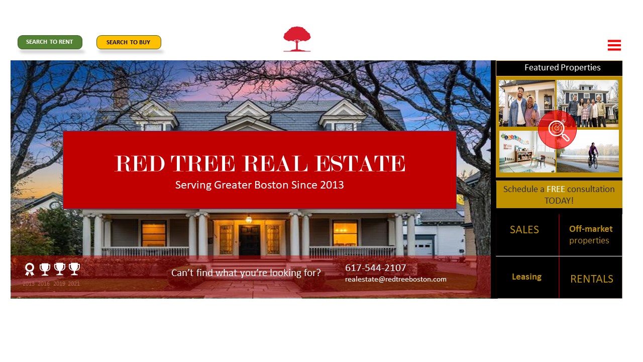
The owners decided to implement a new search UI based on my analysis and a data-driven presentation. The marketing team reported in 3 months that after the implementation the number of leads increased by 25%. Both the owners and the real estate agents were excited and continued to provide feedback to me. I was very excited, too. As a UX designer, I improved the experience of people who are usually very stressed when looking for rental apartments on Boston’s competitive rental market. On the other hand, the owners and the real estate agents witnessed an increase in revenue during a busy rental period. The owners felt, however, that any further redesign of the website is desired but not urgently needed since the cost of implementing a total redesign of the website is too expensive at the moment given that the current web design was implemented 2 years ago. It was agreed to revisit the idea of overhauling the existant design in 1-2 years.